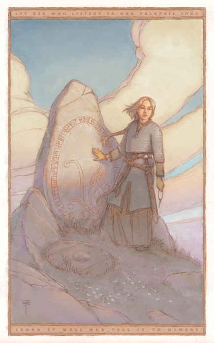
This is another piece created for one of Jon Schindehette’s Art Order events: the “Viking” challenge produced in collaboration with Allison Hourcade of RockLove Jewelry. Allison has produced a really wonderful new line of work based on historical viking hoard finds, and the art challenge was simply to include one or several of these pieces into an illustration.
I decided this would fit in thematically with some work I am currently doing anyway. I’ve been researching viking history quite a bit in recent years, and I’m especially interested in some of the newer theories about social structure, fashion and gender roles. This character builds off accepted historical material and plays into some of the newer ideas.
As with Drakflickan, the model for the young woman was the gracious, beautiful and very patient Elin Hökby, who quite definitely possesses a valkyrie’s spirit.
Rune stones are pretty fascinating in and of themselves, and I’ve been lucky enough to get to see some important ones up close. I thought this was a good opportunity to get one into a painting. The inscription on the stone is several stanzas which I quite liked from the skaldic poem Darraðarljoð. The Younger Futhark runes spell out the stanzas in Old Norse, and I hope I didn’t muck it up too badly.
Carl Larsson’s Viking Woman was also an inspiration for this piece.
Wanderlust won first prize in the Comic/Graphic Novel category, and was one of the three nominees for “Best of Show”. Sincere thanks to all the judges and organisers for your time and effort in producing the challenge!
Also as with Drakflickan, the painting is graphite on 120g Canson croquis paper, and was digitally coloured in Photoshop CS6 using Justin Gerard’s excellent watercolour tool presets.

Congratulations, Dave. Well deserved recognition.
Thanks for the kind words, Kim! I’m quite pleased that the judges liked the work…
Congratulations Dave. It’s a lovely piece, reminiscent of classic illustrators from the early 20th Century. I really like the low contrast and desaturated colors: they lend it a graceful, feather-like touch that works wonderfully with the line art.
Thanks, Nick! You know, several of the judges mentioned the low contrast, and I really thought about what they said – I’ve noticed for years that I tend to work that way, even in design work. I decided to adjust a version that was more saturated and had deeper values. It seemed to work well at first, but the more I looked at it beside the original, the more I began to feel I’d got it right the first time.
If this piece is viewed in with all the other entries (which tend to be very high contrast), it can definitely seem pale by comparison. On its own, though, it feels just right to me… more like that softness that the light can sometimes get in the early morning or near dusk…